Maps are very useful to identify where particular species may or may not be found, and how their distributions may have changed through time. Here, we show how BBS data can be used to map the abundance of species across the UK to show where particular species may be most often recorded, and to indicate how bird populations may be changing in different parts of the country.
The BBS is now the main source of continuous monitoring data for common and widespread bird species in the UK. Although a large number of BBS squares are surveyed, they only amount to just over 1% of the land area of the UK. However, as the squares to be surveyed are selected randomly within each BBS region, this means we can regard the BBS data as representative of unsurveyed areas. We can use information about the characteristics of each square (such as the habitat or climate), and the detectability of each species to examine how breeding densities vary in relation to those characteristics.
This statistical model can then be used to predict the abundance or trends of species across un-surveyed areas using information about the environment in those areas, accounting for the fact that nearby locations are more likely to have similar abundances and trends than locations far apart. In addition, an understanding of these relationships enables us to predict the effects of changes in the environment upon bird populations. Two examples of this approach are outlined below.
 Effect of deer on woodland birds
A number of species of deer have been expanding their ranges over the past few decades, and we used BBS mammal data to map these expansions. Surveyors optionally record sightings of mammals whilst conducting their bird surveys, and we use these records to estimate the relative abundance of deer across England, based on counts from surveyed squares. Because deer are not recorded using distance bands, these are estimates of the average number recorded in a square rather than actual density. Importantly, these provide some of the first and most detailed maps of deer abundance and population changes through time (See maps below of Fallow Deer abundance in 1995 and 2006).
These are not just interesting maps; deer can damage woodland understory vegetation, so the maps have also been useful to test whether increasing deer populations can affect bird species which rely on the same habitat. We used counts of 11 passerine species associated with dense understory and tested whether higher deer abundance led to lower population growth of the bird species. For many bird species we found the expected negative effects of deer abundance on their population growth, although most of these were not statistically notable or of biological importance. The largest significant effects were negative effects on population growth of Nightingale and Willow Tit, by Roe Deer.
Newson, S.E., Johnston, A., Renwick, A.R., Baillie, S.R. & Fuller, R.J. (2012). Modelling large-scale relationships between changes in woodland deer and bird populations. Journal of Applied Ecology 49(1): 278–286.
http://onlinelibrary.wiley.com/doi/10.1111/j.1365-2664.2011.02077.x/abstract
Mapping bird populations and trends
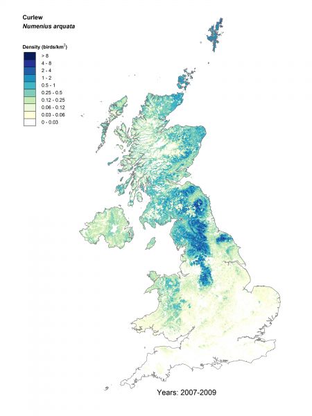
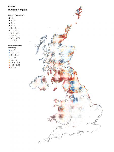
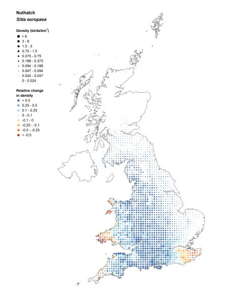
From maps of abundance it is relatively easy to produce maps of population trends, to see how bird populations are faring across the country. Work is currently underway to produce these for a range of relatively common and widespread species well-covered by the BBS survey, but we illustrate this with a couple of examples below: Curlew and Nuthatch, two species with contrasting fortunes.
For each species we have produced a map of the density of birds across the UK during 2007–2009 (left), which predicts where the species is most abundant based on variation in habitat and location. This is complemented by a second map (right) of variation in the trend in that bird species from 1994–1997 to 2007–2009, in which the colour at each point now represents the change in abundance in each 10km square, and the size of the point indicates average density to help interpret how important these changes in abundance are. Therefore large red dots represent large declines in areas of high abundance, which are most likely to drive significant population declines whilst small red dots may indicate the locations where a species may be most likely to lost.
Curlew densities are greatest in upland areas of the Pennines, North Yorkshire, the Southern Uplands and Orkney. Population declines have been widespread, with a -44% population decline across the UK from 1995–2010, which are been particularly marked in western Britain. Densities in the English uplands appear to have held up.
Nuthatch has a south-westerly distribution, being particularly abundant in deciduous woodlands of southern and western England, and Wales. It has increased widely, and is become more common in northern and eastern England, and southern Scotland, although with a hint of decline in Kent.
New maps of population density and trends are available here.
View relative abundance maps produced in 2003
 BBS and the Atlas
Interested in how maps of BBS trends relate to maps from the 2007–11 Bird Atlas? Download this BTO News article:
From monitoring to maps
(PDF).


